In this Photoshop text effects tutorial, we're going to learn how to create a fire text effect, engulfing our letters in burning hot flames. We'll be using Photoshop's powerful Liquify filter for most of the work on the flames themselves, but we'll also be taking a look at the Wind filter, using adjustment layers to colorize the flames, layer styles for adding color to our text, layer masks for blending the flames with the letters, and more!
Here's the result we'll be working towards:
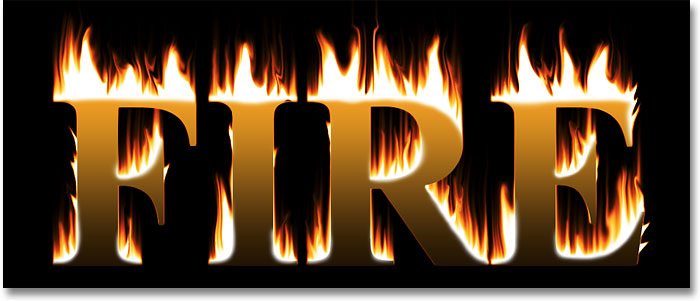
The final "fire text" effect.
Step 1: Create A New Blank Photoshop Document
Let's begin by creating a new blank Photoshop document. Go up to the File menu at the top of the screen and choose New. Or, for a faster way to create a new document, use the keyboard shortcut Ctrl+N (Win) / Command+N (Mac). Either way brings up Photoshop's New Document dialog box. Enter in the dimensions you need for your effect. For this tutorial, I'm going to enter 3 inches for my Width, 3 inches again for my Height, and for the Resolution value, I'll enter 300 pixels/inch. When you're done, click OK to exit out of the dialog box. Your new document will appear on your screen:
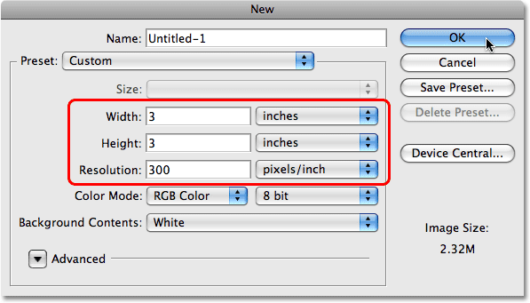
Create a new Photoshop document using the New Document dialog box.
Step 2: Fill The New Document With Black
Since our flaming text probably won't look very impressive against a
white background, let's fill our new document with black. For that,
we'll use Photoshop's Fill command. Go up to the Edit menu at the top of the screen and choose Fill, or press Shift+F5 to select the Fill command with the keyboard shortcut:
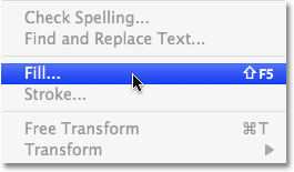
Go to Edit > Fill.
When the Fill dialog box appears, choose Black for the Contents at the top of the dialog box, which tells Photoshop that we want to use black as our fill color:
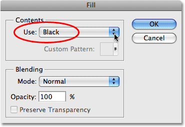
Choose Black at the top of the Fill dialog box.
When you're done, click OK in the top right corner of the dialog box to exit out of it. Your document will now be filled with solid black:
The background of the document is now filled with black.
Step 3: Select The Type Tool
We'll need some text to work with, and for that, we'll need Photoshop's Type Tool. Select it from the Tools palette, or press the letter T on your keyboard to select it with the shortcut:

Select the Type Tool.
Step 4: Choose A Font
With the Type Tool selected, you'll see that the Options Bar
at the top of the screen has changed to show options specifically for
the Type Tool. Choose whichever font you'd like to use for the effect.
This fire effect tends to work best with serif fonts, so I'm going to
choose Times New Roman Bold. Don't worry about the size of the font for now:

Choose a font from the Options Bar.
Step 5: Set Your Text Color To White
We'll use white as our initial text color, even though we'll be
adding more colors later on. To quickly set your text color to white,
press the letter D on your keyboard, which resets Photoshop's Foreground and Background colors to their defaults, making your Foreground color black and your Background color white, as we can see by looking at the Foreground and Background color swatches
near the bottom of the Tools palette. The Foreground color swatch is
the one in the top left. The Background color swatch is on the bottom
right:

The Foreground and Background color swatches in the Tools palette.
The text color and Foreground color are one in the same in Photoshop.
Changing one also changes the other, which means that in order to
change our text color to white, all we need to do is change the
Foreground color to white. At the moment, our Background color is set to
white, with our Foreground color set to black, exactly the opposite of
what we need. To swap them, making white the Foreground color, simply
press the letter X on your keyboard. If we look at the
two color swatches once again in the Tools palette, we can see that our
Foreground color is now set to white:

Press "X" to swap the Foreground and Background colors.
Step 6: Add Your Text
With the Type Tool selected, a font chosen and your Foreground (text)
color set to white, click inside your document and add your text. I'm
going to type the word "FIRE", all in capital letters:
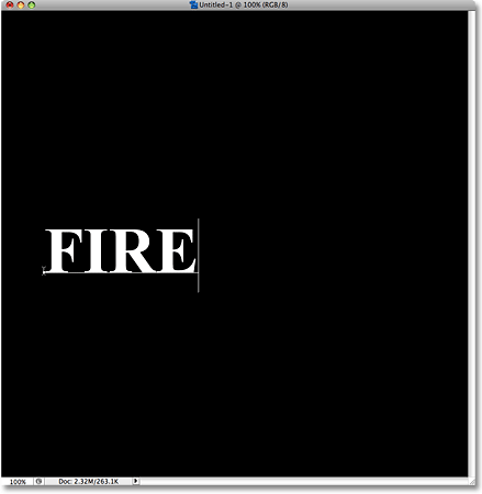
Add your text to the document.
When you're done, click on the checkmark in the Options Bar to accept the text and exit out of text editing mode:

Click on the checkmark in the Options Bar to accept the text.
Step 7: Resize And Move The Text If Needed With Free Transform
My text is a little too small at the moment, so I'm going to resize it using Photoshop's Free Transform command, which I can also use to move the text. Go up to the Edit menu at the top of the screen and choose Free Transform, or press Ctrl+T (Win) / Command+T (Mac) to access it with the keyboard shortcut:
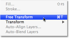
Go to Edit > Free Transform.
You'll see the Free Transform box and handles appear around the text in the document. To resize the text, hold down your Shift
key, which will maintain the aspect ratio of the text as you resize it,
then click on any of the corner handles (the little squares) and drag
it inward or outward depending on whether you need to make the text
smaller or larger. To move the text, click anywhere inside the Free
Transform box and drag the text to a new location. I'm going to make my
text larger and move it into the bottom center of my document, which is
where you'll want to move your text as well. Press Enter (Win) / Return (Mac) when you're done to accept the transformation and exit out of the Free Transform command:
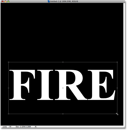
Resizing and moving the text with Free Transform.
Step 8: Rasterize The Text
At this point, we've done all we can with our text while it's still
text. To continue on with the next steps in our fire effect, we'll need
to convert our text into pixels, which in Photoshop is known as rasterizing
the text. Make sure you have everything spelled correctly before you
proceed, since the text will no longer be editable once we've rasterized
it. To convert the text into pixels, go up to the Layer menu at the top of the screen, choose Rasterize, and then choose Type:
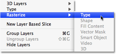
Go to Layer > Rasterize > Type
Nothing will seem to have happened to the text in the document, but
if we look in the Layers palette, we can see that the text layer,
sitting directly above the Background layer, has been converted into a
normal, pixel-based layer. We're now essentially working with an image
that looks like text rather than actual text, although I'll still refer to it as the text layer to keep things simple as we go along:
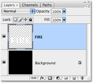
The text layer in the Layers palette has been converted into a normal layer.
Step 9: Duplicate The Text Layer
To create the flames effect, we'll need to work on a copy of our text
layer, which means we need to duplicate the layer. The easiest way to
duplicate a layer in Photoshop is with a keyboard shortcut. First, make
sure you have the text layer selected in the Layers palette (selected
layers are highlighted in blue), then press Ctrl+J (Win) / Command+J
(Mac). Once again, nothing will seem to have happened in the document
itself, but we can see in the Layers palette that we now have a copy of
the text layer sitting above the original (the copy has the word "copy"
added to its name):
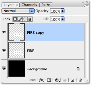
The Layers palette showing a copy of the text layer directly above the original.
Step 10: Turn The Copy Off For Now
We've duplicated the text layer, but we're actually going to create
the main fire effect on the original text layer, saving the copy for
later. In fact, we don't even need to see the copy for the moment, so
click on the small eyeball icon (officially known as the layer visibility
icon) on the far left of the layer in the Layers palette. The eyeball
will disappear from the Layers palette, and the layer itself will
disappear in the document:
Hide the text copy layer by clicking on the eyeball icon on the left of the layer.
Step 11: Select The Original Text Layer
With the copy now hidden from view, click on the original text layer in the Layers palette to select it:
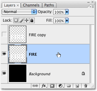
Click on the original text layer to select it and make it active.
Step 12: Rotate The Canvas 90° Clockwise
To create the flames for our fire text effect, we'll be using a few
of Photoshop's filters, and the first one we'll be using - the Wind
filter - only works from left to right (or right to left), which means
that in order to use it, we'll need to rotate our image. Go up to the Image menu at the top of the screen, choose Rotate Canvas, and then choose 90° CW (clockwise):

Go to Image > Rotate Canvas > 90° CW.
This rotates the image so that the text is now appearing along the left of the document:
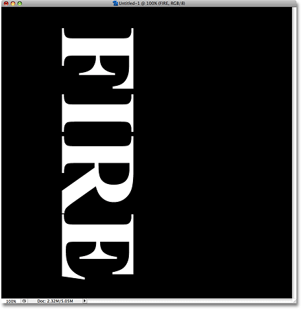
The text now appears along the left of the document.
Step 13: Apply The Wind Filter
We're ready to apply the Wind filter. Go up to the Filter menu at the top of the screen, choose Stylize, and then choose Wind:
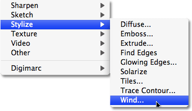
Go to Filter > Stylize > Wind.
This brings up the Wind filter dialog box, which consists of a
preview area in the top left and a few options below it. The options are
divided into two sections, Method and Direction. Make sure that Wind is selected for the Method, then down at the bottom, set the Direction to From the Left:
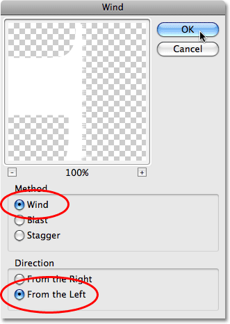
Set the Method to "Wind" and the Direction to "From the Left".
Click OK when you're done to exit out of the dialog
box and apply the Wind filter. They're a little hard to make out in the
screenshot, but you'll see small streaks appearing from the letters
extending out towards the right:
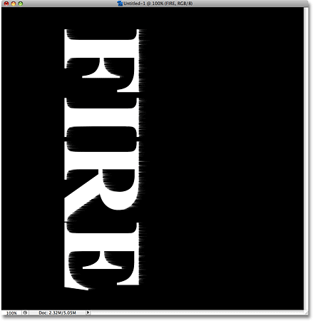
Small streaks appear from the letters after applying the Wind filter.
Step 14: Re-Apply The Wind Filter A Couple More Times
The streaks are too small and subtle after applying the Wind filter
once, so let's re-apply it a couple of times. To quickly re-apply the
last filter you used, simply press Ctrl+F (Win) / Command+F (Mac). Each time you press the keyboard shortcut, you'll apply the filter again. I'm going to press the keyboard shortcut twice to apply the Wind filter two more times to the text. This makes the streaks much longer and more pronounced:
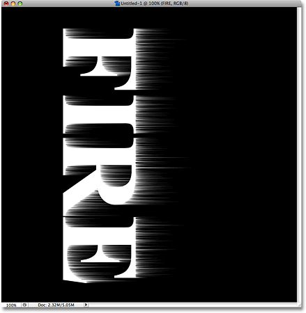
The streaks are now much more visible after applying the Wind filter three more times.
Step 15: Rotate The Canvas 90° Counterclockwise
We're done with the Wind filter, so let's rotate our image back to the way it was originally. Go back up to the Image menu, choose Rotate Canvas once again, and this time, choose 90° CCW (counterclockwise):

Go to Image > Rotate Canvas > 90° CCW.
This rotates the image back to its original position:
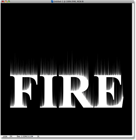
The image is now back to its original position.
Step 16: Apply The Gaussian Blur Filter
We need to soften the streaks up a little bit by applying a small amount of blurring to them. For that, we'll use Photoshop's Gaussian Blur filter. Go up to the Filter menu at the top of the screen, choose Blur, and then choose Gaussian Blur:
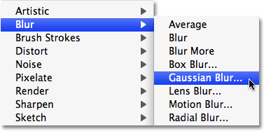
Go to Filter > Blur > Gaussian Blur.
This brings up the Gaussian Blur dialog box. All we want to add is a small amount of blurring, so I'm going to enter a Radius value of about 1.2 pixels down at the bottom of the dialog box:
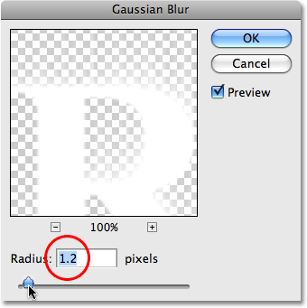
Enter a Radius value of around 1.5 pixels in the Gaussian Blur dialog box.
Click OK when you're done to exit out of the dialog
box and Photoshop applies the blurring effect. Your streaks should now
have a softer look to them:

The white streaks now appear with a soft blur.
Step 17: Duplicate The Background Layer
Click on the Background layer in the Layers palette to select it. Then use the same keyboard shortcut we used earlier, Ctrl+J (Win) / Command+J
(Mac), to duplicate the Background layer. You'll see a copy of the
Background layer, named "Background copy", appear above the original in
the Layers palette:
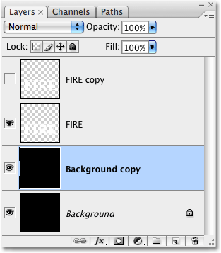
The Layers palette showing a copy of the Background layer sitting above the original.
Step 18: Merge The Text Layer With The Background Copy Layer
If you look at the text layer in the Layers palette, you'll see a preview thumbnail
to the left of the layer's name which shows us a small preview of the
contents of the layer. Notice how most of the thumbnail is filled with a
checkerboard pattern? That checkerboard pattern is how Photoshop
represents transparency, which means that our text is currently
surrounded by nothing but transparency. We need to fill all that
transparent area with black. To do that, we'll merge the text layer with
the copy of the Background layer we just created.
To merge the two layers together, first click on the text layer in the Layers palette to select it. Then go up to the Layer menu at the top of the screen and choose Merge Down near the bottom of the list of options:
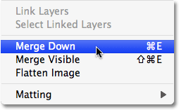
Go to Layer > Merge Down.
This merges the text layer with the Background copy layer directly below it:
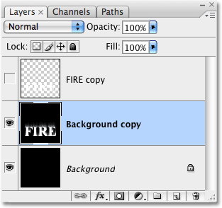
The text layer and the Background copy layer are now merged into one.
Step 19: Rename The Merged Layer "Flames"
Unfortunately our merged layer, which contains our text, has kept the
name "Background copy". It's not a huge problem but it could make
things confusing for us, so let's rename the layer. Double-click directly on the layer's name and rename it "Flames":
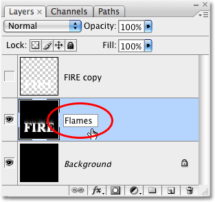
Rename the merged layer "Flames".
Step 20: Draw A Rectangular Selection Around The Text
In a moment, we're going to bring our image into Photoshop's Liquify
filter, a very powerful (and fun) filter used for warping and twisting
pixels. Unfortunately, its power comes at a price. Depending on the size
and complexity of the image you're working on, the Liquify filter can,
on occasion, slow your computer down to a crawl, especially if you're
working on an older system. In our case here, we're not working with
anything terribly complex so we shouldn't run into any problems, but one
way to limit how much work Photoshop has to do is to limit how much of
the image actually opens inside the Liquify filter.
So how to we do that? We simply drag a selection around the area that we want to work with! First, we'll need the Rectangular Marquee Tool, so either select it from the Tools palette or press the letter M on your keyboard to select it with the shortcut:

Select the Rectangular Marquee Tool.
Then, with the Rectangular Marquee Tool selected, simply click and
drag a selection around the text, including the white streaks that we
created with the Wind filter. Make sure to leave extra room above the
text for our flames. Your selection should look something like this:
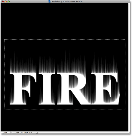
Drag a rectangular selection around the text, leaving extra room at the top for the flames.
Step 21: Apply The Liquify Filter
With the area that we want to work with selected, go up to the Filter menu at the top of the screen and choose Liquify:
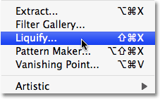
Go to Filter > Liquify.
This brings up Photoshop's massive Liquify filter dialog box, which
consists of some tools along the left, a very large preview area in the
center, and a lot of potentially confusing options on the right. If
you've never used the Liquify filter before, there's no need to panic.
For this effect, all we need here is one tool, one option, and the
preview area. Everything else, we can safely ignore.
First, select the Forward Warp Tool from the very top of the list of tools along the left:
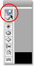
Select the Warp Tool in the top left corner of the dialog box.
Next, over on the right of the dialog box, you'll see a section called Tool Options, and the very first option in this section is Brush Size.
This is where we can change the size of the brush we're using, and it's
the only option we need for this effect. Start with a medium size
brush. The default brush size of 100 should work fine:
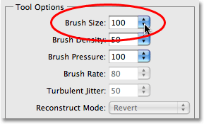
The Brush Size option on the right of the Liquify dialog box.
The first thing we'll do is give our white streaks more of a wispy
look to them. Click inside the streaks at different spots and drag your
mouse a short distance either left or right to gently warp the streaks
and give them some subtle, random curves. Just click, drag a short
distance and release your mouse button, then click and drag again in a
different area. Try not to click inside the letters themselves for now.
Just warp and wiggle the streaks. Don't forget to include the streaks in
the middle and bottom sections of the letters. When you're done, you
should end up with something similar to what I have in the screenshot
below:
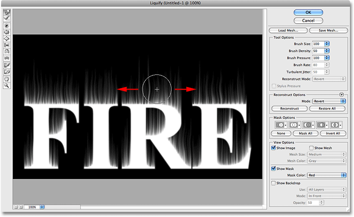
Click and drag inside the white streaks with the Forward Warp Tool.
Go back over to the Brush Size option on the right of the dialog box and choose a much smaller brush size. I'm going to set mine to around 15:
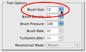
Select a much smaller brush size.
This time, click directly inside the letters and drag your mouse
upward to create the shapes of little flames shooting out from them. You
can drag straight up for some of the flames, but for others, try to
drag on more of an angle to add more variety. Wiggling your mouse a
little as you drag upward will also help create more interesting looking
flames. If you make a mistake, press Ctrl+Z (Win) / Command+Z (Mac) to undo your last brush stroke, then continue on. If you need to undo several steps, press Ctrl+Alt+Z (Win) / Command+Option+Z
(Mac) as many times as you need. When you're done with the tops of the
letters, do the same thing with the bottom of the letters, as well as
any other areas that look like they could use some flames shooting out
of them. Don't spend too much time thinking about where your next flame
should go, since fire should look random and chaotic, not planned and
controlled. You should end up with something like this:
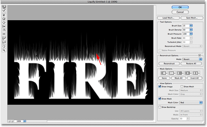
Click inside the letters and drag upward to create small flames shooting out of the letters.
Finally, let's create some larger flames. Go back over to the Brush Size option and choose a larger size brush. I'm going to set my brush size to 50:
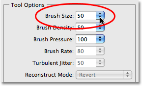
Select a larger brush size.
Once again, click directly inside the letters and drag upward, this
time creating larger flames. Just as we did with the smaller flames, try
to add some variety by dragging upward at different angles and wiggling
your brush to bend and twist the shapes. Again, don't forget about the
bottom and middle sections of the letters. When you're done, your final
result should look something like this:
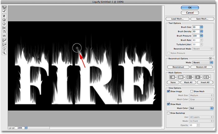
Create a few larger flames with the larger size brush.
Click OK to exit out of the Liquify filter dialog
box. There may be a brief pause while Photoshop applies the effect to
the document, but when it's done, your text should be engulfed in a
blaze of unrealistically white fire:
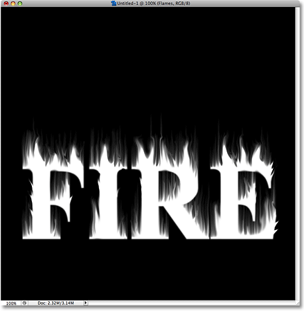
Our liquified flame effect.
Step 22: Add A Hue/Saturation Adjustment Layer
Let's add some color to our flames. For that, we'll use a Hue/Saturation adjustment layer. Click on the New Adjustment Layer icon at the bottom of the Layers palette, then select Hue/Saturation from the list that appears:
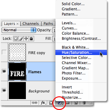
Select a Hue/Saturation adjustment layer from the bottom of the Layers palette.
This brings up the Hue/Saturation dialog box. First, select the Colorize option in the bottom right corner of the dialog box. Then, in the center of the dialog box, set the Hue value to around 40 for a warm yellow/orange color, then crank the Saturation value all the way up to 100 to really boost the color's intensity:
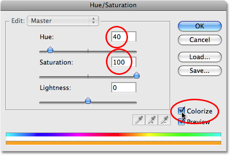
Colorize the flames with a bright yellow/orange color.
Click OK to exit out of the Hue/Saturation dialog box. Our flames are starting to look much better, but we're not quite done yet:
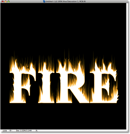
The flames now appear warmer with a yellowish orange color.
Step 23: Add A Second Hue/Saturation Adjustment Layer
We'll add one more color to our flames using a second Hue/Saturation adjustment layer. Click once again on the New Adjustment Layer icon at the bottom of the Layers palette and select Hue/Saturation from the list. This time, don't select the Colorize option. Just set the Hue value to around -15 for a deeper orange color. Click OK when you're done to exit out of the dialog box:
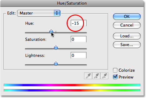
Set the Hue value to around -15 in the second Hue/Saturation dialog box.
Step 24: Change The Blend Mode Of The Adjustment Layer To Overlay
Go up to the Blend Mode option in the top left
corner of the Layers palette (it's the drop-down box that by default is
set to "Normal"). Change the blend mode for the second Hue/Saturation
adjustment layer to Overlay:
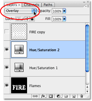
Change the blend mode of the second Hue/Saturation adjustment layer to Overlay.
This adds a more realistic color combination to our flames, with the
lighter areas keeping the bright yellowish orange color from the first
Hue/Saturation adjustment layer and the darker areas now appearing with a
deeper, richer shade of orange:
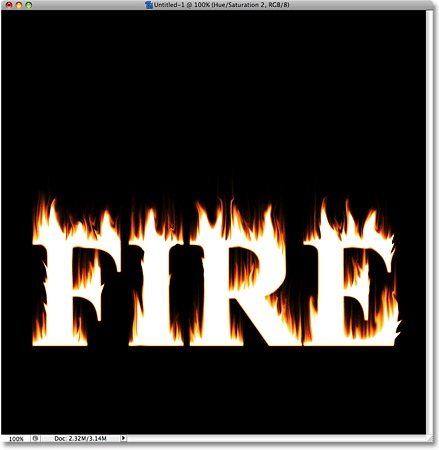
The flames now appear with much more natural colors.
Step 25: Select And Turn On The Text Copy Layer
At this point, we're done with our flames. We'll finish off our
effect by working on the text copy layer that we created way back at the
beginning of the tutorial. Before we can work on it though, we'll need
to turn it back on since it's currently hidden from view. First, click
on the text copy layer in the Layers palette to select it. Then click on
the layer visibility icon (the empty square) on the far left of the layer to turn the layer back on in the document:
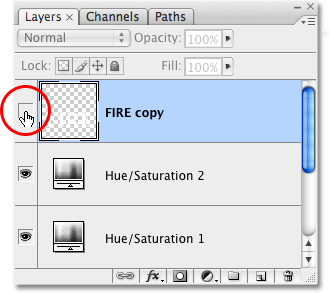
Select the text copy layer, then click on the layer visibility icon.
Step 26: Add A Gradient Overlay Layer Style
Let's add some color to our text. With the text copy layer now selected and visible, click on the Layer Styles icon at the bottom of the Layers palette and choose Gradient Overlay from the list that appears:
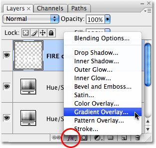
Click on the Layer Styles icon, then select Gradient Overlay.
This brings up Photoshop's Layer Style dialog box set to the Gradient Overlay options in the middle column. Click on the gradient preview area in the center of the options:
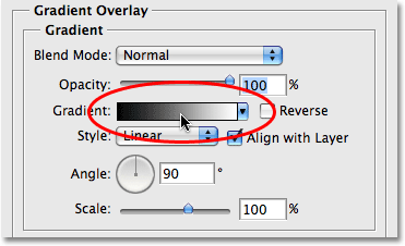
Click on the gradient preview area.
This brings up Photoshop's Gradient Editor. In the
bottom half of the Gradient Editor is where we can create our own custom
gradient. You'll see a thin horizontal bar showing a preview of the
current gradient colors, with a small color stop
directly below it on each end. Let's change the color on the left of the
gradient. Click on the color stop on the left to select it, then click
on the color swatch at the bottom of the dialog box:
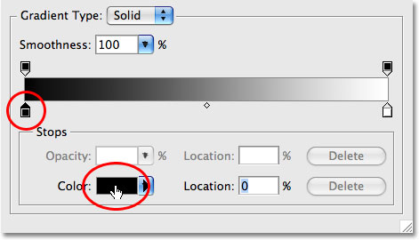
Click on the color stop on the left, then click on the color swatch to change its color.
This brings up Photoshop's Color Picker. Choose a dark orange/brown color, which will be used for the bottom of our letters, then click OK to exit out of the Color Picker:
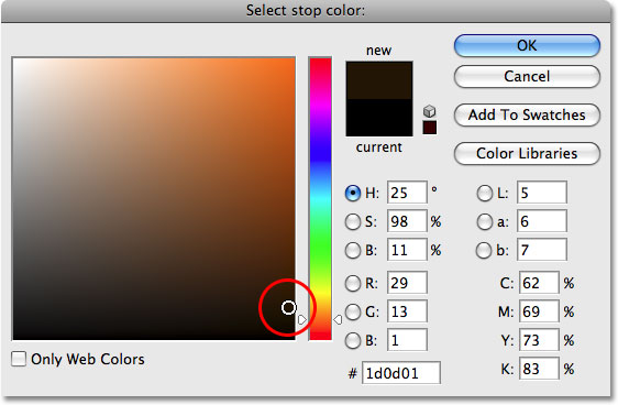
Choose a dark orange/brown color for the left side of the gradient.
Back in the Gradient Editor, click on the color stop below the right side of the gradient preview bar to select it, then click again on the color swatch:
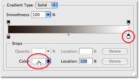
Click on the color stop on the right, then click on the color swatch to change its color.
When the Color Picker appears, choose a bright orange color which will appear at the top of our letters. Click OK when you're done to exit out of the Color Picker, then click OK to exit out of the Gradient Editor since we've now chosen our colors for the gradient:
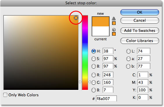
Choose a bright, saturated orange color for the right side of the gradient.
At this point, the only dialog box open on your screen should be the
Layer Style dialog box. You'll see that the gradient preview area is now
showing the new colors we selected. Make sure the Style option is set to Linear and that the Align with Layer option is selected. Also, make sure the Angle of the gradient is set to 90°:
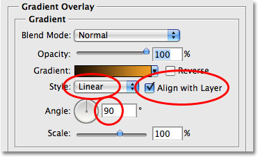
Click on the gradient preview area.
Click OK when you're done to exit out of the Layer Style dialog box. Our custom gradient is now applied to our text:
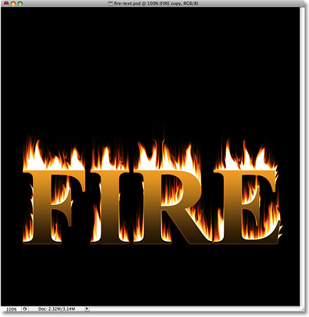
Everything is now looking much more colorful.
We could stop here if we wanted to, but right now, it looks like text
sitting in front of flames. I want the effect to look more like the
text itself is on fire. We'll add some finishing touches to our fire
text effect next!
Step 27: Add A Layer Mask To The Text Layer
At the moment, it looks like our text and the flames are two separate
things (which of course they are). It looks like the text is sitting it
front in our document and the flames are burning away behind it. That's
fine if that's the effect you want, but what I want is for it to look
more like the letters themselves are on fire, which means we need a way
to blend the text and the flames together. The reason it looks like the
text and the flames are separate is because we can clearly make out the
sharp edges of the letters in front of the flames. Let's finish things
off then by removing some of those sharp edge. We'll do that using a layer mask.
With the text layer still selected, click on the Layer Mask icon at the bottom of the Layers palette:
Click on the Layer Mask icon at the bottom of the Layers palette.
This adds a layer mask to the text layer. We can't see it in the
document itself, but if we look in the Layers palette, we can see that a
layer mask thumbnail has appeared on the text layer:
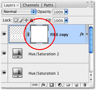
A layer mask thumbnail appears on the text layer.
Step 28: Select The Brush Tool
Grab Photoshop's Brush Tool from the Tools palette, or quickly select it by pressing the letter B on your keyboard:

Select the Brush Tool.
Step 29: Set The Foreground Color To Black
To remove some of the sharp edges from the text, we'll need to paint
over them on the layer mask with black, which means we need to set our Foreground color to black.
Make sure you have the layer mask selected in the Layers palette (the
layer mask thumbnail should have a white highlight border around it.
Click on it to select it if it doesn't). Press the letter D
on your keyboard to quickly set your Foreground and Background colors
to their defaults. This can be a bit confusing, but when you have a
layer mask selected, the default Foreground and Background colors are
actually the opposite of what they are normally (see Step 5).
Your Foreground color will become white and your Background color will
become black (if they're not already). We need to swap them, which we
can do by pressing the letter X on the keyboard. As we can see in the color swatches in the Tools palette, the Foreground color is now set to black:

The Foreground color swatch in the Tools palette showing black as the current color.
Step 30: Paint Away Some Of The Sharp Edges Of The Letters
With the layer mask and Brush Tool selected and black as our
Foreground color, use a small, soft edge brush to paint away some of the
sharp edges of the letters, especially along the tops but also in
different areas along the bottom and in the middle. The easiest way to
resize your brush is with the left and right bracket keys (the [ and ]
keys to the right of the letter P on the keyboard). Pressing the left
bracket key makes the brush smaller each time you press it. The right
bracket key makes the brush larger. To soften the brush edges, hold down
your Shift key and press the left bracket key a few times. Each time makes the brush edges softer until you reach 0% hardness. Holding Shift and pressing the right bracket key
makes the brush edges harder. Again, you'll want to use a small, soft
edge brush for this. As you paint, the edges will disappear revealing
the flames underneath, giving the illusion that the letters themselves
are on fire:
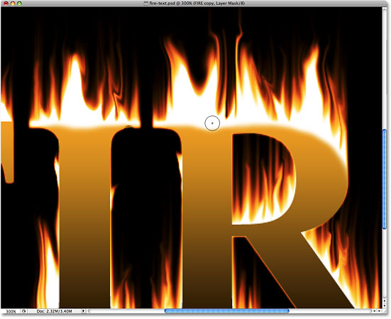
Paint away some of the sharp letter edges to reveal the flames underneath.
If you make a mistake, press the letter X on your keyboard to swap the Foreground and Background colors, making white your Foreground color. Paint with white over the mistake, the press X
to swap the colors again and continue painting away the edges. Here's
what my effect looks like after making my way around each letter. The
text itself now looks as if its on fire after blending the edges with
the flames:
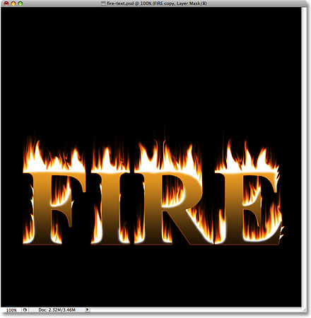
The letters themselves now appear to be on fire after blending the flames with the text edges.
If you notice the same problem I'm seeing, where the very bottom of
the text appears to be slightly higher than the flames, creating an
orange outline around the bottom of the letters, simply press the
letter V on your keyboard to quickly select the Move Tool, then press the down arrow key on your keyboard once or twice to nudge the text down until the letters and the flames line up.
And with that, we're done! Here is my final "fire text" effect:

The final "fire text" effect.
No comments:
Post a Comment